Saturday, October 6, 2012

The broadest nib - vintage Montblanc 149


Personal Best of, Part 4

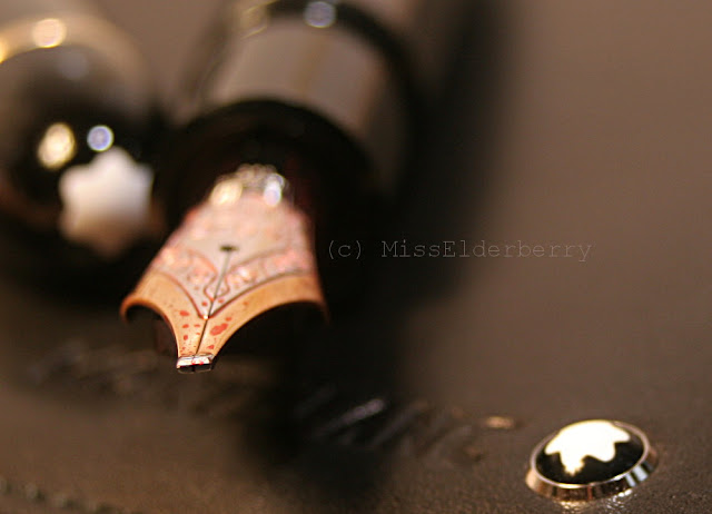
This pen has been a rather recent addition. It's Montblanc's flagship pen, the Meisterstück No. 149, also called "the cigar" - the reason is evident when you look at the pen. This particular specimen must have been made at the beginning of the 1980s - Montblanc changed details about these every few years so they're fairly easy to date. They had different shapes and materials of feeds, piston threads and, of course, nibs, where there are variations as well in the alloy (you can find 14k, 14c, 18k, 18c, it makes your head spin) as in the plating of the nib surfaces. Modern 149s nibs are tri-color which means the nib is mostly yellow gold with a small rhodium plated strip around the center. This one is quite the opposite, mainly rhodium plating with some narrow yellow gold area around the edge (I think I like this one more). On the following picture the yellow gold looks very orange which is a kind of tarnishing because the pen obviously had never been used. I polished the nib gently with a paper tissue and now the yellow gold is somewhat brighter again.

Fountain Pen Network is a great resource for finding out how old your pen is and a lot of other interesting stuff.


80s Montblanc Meisterstück 149 with its original box


Not only the pens themselves but also their boxes have changed a lot over time. The today's 149 box is very posh, huge with a satin lining and containing a black ink bottle. The 80s presentation was far more modest.


Among Friends: the 149 on a Meisterstück leather notebook cover.

I had to hunt a pen like this one for a while because of its nib - most 149s around seem to have fine or medium nibs. I can't really see any reason for this since, hey, this is the signature pen, right, and would you really want to sit behind your huge "boss" writing desk and sign your letters with your huge "boss" pen which has a really tiny tip? I wouldn't think so but well, most people would obviously disagree.

This 149 is different, its nib is as fat and bold as the pen itself. I think it's an oblique triple broad (O3B) though I can't be 100% sure since the pen didn't come with any papers stating the nib size. Montblanc doesn't stamp the size on its nibs so there's always some guesswork involved. In any case and as you can see, this is some nib and a smooth, luscious, wet writer with lots of line variation. Its boldness just blew me away at the beginning but I got used to it quickly. It's no use for something like a postcard of course, but lovely for letters or a journal.

Some nib? Some nib indeed!

The little writing sample is done on a sheet from a cute little notepad which came with a Montegrappa pen and is printed "flying thoughts". I wouldn't really know what to use it for so it's sitting on my desk, but it's kind of neat anyway.


a bit of writing and a lot of fingerprints

Nibs it has easily outshone in terms of broadness: Pelikan O3B and IB, Nakaya/Platinum Music nibs, Montblanc OBB,


I am very sure that in its dreams that pen stands all alone on a dimly lit stage and swings its feather boa, singing "... and what I am needs no excuses!"


The oldest age - Pelikan 400

While I thought of an interesting way to introduce my pens, the idea of a personal "Best of" occured to me, since my "collection" doesn't have a specific theme yet. It's a crowded lot of vintage (few) and modern (most) pens, large and small, made of all kinds of materials, though there is a lot of Urushi, the traditional Japanese lacquer, around lately. So since it's a little hard to get an order into this, I'll just start by presenting the extremes and go from there.


Personal Best of, Part 1

Since I'm less than an expert at vintage pens it's hard to say. It might be this Pelikan 400 Tortoise from the 1950s (of course it's not genuine tortoiseshell but celluloid). I'd like to tell a nice story about how it has been my grandma's pen and she gave it to me when I finished school, but unfortunately I just bought it. Next to my mostly larger and heavier pens it looks like something from another era - fountain pens just used to be smaller back then! 


It has a very nice semi-flexible nib but I still don't use it much - it might be because of the size but more likely because the nib has some starting problems. Obviously, even back in that time some nibs just were annoying.


The pen pouch, however, is indeed a heirloom from my boyfriend's family. It comes from Eastern Germany and was used as a school accessory by his aunt and by himself later on. It's a little battered but still looks nice and, most remarkable, it's really well thought through. One of my pens leaked Diamine Oxblood onto the lining and it cleaned off very well which I hadn't expected at all (and wonder if this could be expected from a, say, Montblanc pen pouch?).
An interesting feature: The five lashes which hold the pens are made of leather and in different sizes. None of them would be large enough to accomodate a modern pen though - and vintage pens do look best in it.

Sunday, September 30, 2012

A "Swift" Decluttering - Montblanc WE Jonathan Swift

These days I've been doing a lot of decluttering. Despite my mail still sitting in a pile on my desk and some of my pens accompanying me to work and back and around the flat so I can play with them whenever them I feel the need - which gives my desk a rather untidy appearance -, I have managed to get rid of some no longer wanted things very successfully by selling them at forums or eBay. 


The great thing is that most of it sold really well and I was able to exchange the clutter into the new Montblanc Writer's Edition "Jonathan Swift". Time to do a review of that pen!

Like all Writer's Editions, it's a piston filler and a rather heavy one at that. Body and cap are metal, covered with black lacquer and platinum plated details, most of which are reference to Swift's most famous work "Gulliver's Travels". I won't explain which parts of the story they are referring to exactly - Montblanc does on their website, if anyone is interested -, but it's a lot of fun to discover the hints, maybe during a re- or even first read of "Gulliver's Travels".


The background of my pictures, by the way, is the slipcase of the gorgeous illustrated German "Gulliver's Travels" edition published by Manesse a few years ago. I was fascinated by how the colours used in the illustration and in the ink bottle's label are a perfect match. Maybe Montblanc took an inspiration from that edition.


I don't have the technical means to take a macro shot of the nib, so you'll have to take my word for it that it shows an intricate design of Gulliver and the inhabitants of Liliput.


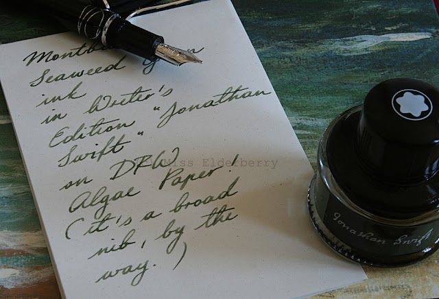
Of course I used the matching ink, at least for the first time, though I wasn't a fan of the colour from the first glance and mainly bought it because I had the pen and, well. Now that I've tried and seen it in person I am, however, quite fond of the colour. It's a nicely shading green-grey-brown ink which indeed reminds of sea weed. Before I had seen the colour I had imagined some dark turquoise like Iroshizuku tsuki-yo or Sailor yama-dori, but it's very different from that (and defintely more original). For a fine and/or dry nib it might be too light though.


To top it off, I remembered that I had some "Algenpapier" (algae paper) from the German Papermill DFW, located in Dresden. It's a greyish paper with very fine specks which are supposed to be the algae. It doesn't look very spectacular really but it's nice, fountain pen friendly and of course fits the Swift theme.

My Swift is fitted with a broad nib which writes a nicely stubbish, wet line and, other than some Montblanc nibs I've had, doesn't have any skipping tendencies at all. This pen definitely isn't in danger of being "decluttered" and will be around here for a while.


Montblanc Jonathan Swift: Nib detail.

Hello & welcome

Pens, inks, paper and all the rest: Welcome to my little blog!

Danitrio Genkai, seirei-nuri


For quite a while I've wanted to start a little blog, a place to put my pen pictures, writing samples, ink reviews and whatnot - and maybe write a bit about all the rest that makes life interesting.

I'm a 29 year old girl, located in Germany, with a passion for beautiful things and writing since I was a little girl. For a few years now I've been collecting - well, I'm not much of a collector really, so let's say accumulating - fountain pens, papers and inks from all over the world, and hopefully over time I'll get to share a fair bit of my collection with my readers. I've also worked a lot on my handwriting (work in progress) and have currently started - well, more like given up on - Palmer Method. I will... might... should revive that some day!

For now I'll start with a few pictures. Please excuse that huge watermark, I've already had some of my pictures show up on eBay so I guess that's necessary.

Ferrari da Varese "Botticelli" white mother of pearl

hand made leather journals for Din A5 inserts


Enjoy!