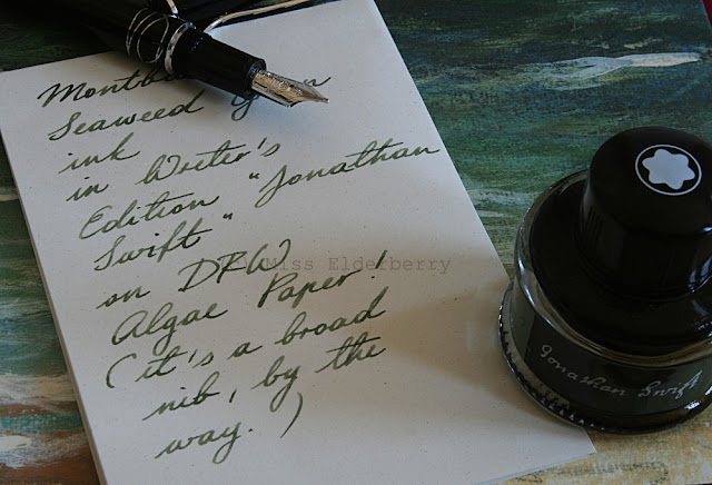
The great thing is that most of it sold really well and I was able to exchange the clutter into the new Montblanc Writer's Edition "Jonathan Swift". Time to do a review of that pen!
Like all Writer's Editions, it's a piston filler and a rather heavy one at that. Body and cap are metal, covered with black lacquer and platinum plated details, most of which are reference to Swift's most famous work "Gulliver's Travels". I won't explain which parts of the story they are referring to exactly - Montblanc does on their website, if anyone is interested -, but it's a lot of fun to discover the hints, maybe during a re- or even first read of "Gulliver's Travels".
The background of my pictures, by the way, is the slipcase of the gorgeous illustrated German "Gulliver's Travels" edition published by Manesse a few years ago. I was fascinated by how the colours used in the illustration and in the ink bottle's label are a perfect match. Maybe Montblanc took an inspiration from that edition.
I don't have the technical means to take a macro shot of the nib, so you'll have to take my word for it that it shows an intricate design of Gulliver and the inhabitants of Liliput.
Of course I used the matching ink, at least for the first time, though I wasn't a fan of the colour from the first glance and mainly bought it because I had the pen and, well. Now that I've tried and seen it in person I am, however, quite fond of the colour. It's a nicely shading green-grey-brown ink which indeed reminds of sea weed. Before I had seen the colour I had imagined some dark turquoise like Iroshizuku tsuki-yo or Sailor yama-dori, but it's very different from that (and defintely more original). For a fine and/or dry nib it might be too light though.
To top it off, I remembered that I had some "Algenpapier" (algae paper) from the German Papermill DFW, located in Dresden. It's a greyish paper with very fine specks which are supposed to be the algae. It doesn't look very spectacular really but it's nice, fountain pen friendly and of course fits the Swift theme.
My Swift is fitted with a broad nib which writes a nicely stubbish, wet line and, other than some Montblanc nibs I've had, doesn't have any skipping tendencies at all. This pen definitely isn't in danger of being "decluttered" and will be around here for a while.
 |
| Montblanc Jonathan Swift: Nib detail. |


