Sunday, May 12, 2013

Pelikan M1000 Sunlight

 ... yes, finally! :-D


It took me quite a while to work out the best lighting for Abalone shell and as I haven't had much success I went back to using plain daylight. So here's the long awaited pictures.

Pelikan M1000 Sunlight

Like the M1000 Moonlight it's Raden work done on a black M1000 corpus. The stripes on the Sunlight, however, are somewhat narrower and much more vivid in color, ranging from yellow to green, blue and purple. I could imagine this burst of color just needs to be counterbalanced by larger black spaces, else it would probably make you dizzy.
The color difference to the Moonlight, which is mostly done in shades of green, blue and purple, is due to different kinds of mother of pearl. First I thought it's just different parts of the shell, but it's actually different species. The sea snail with blue-green mother of pearl is found in the Australian sea whereas the other kind is found in the Japanese sea.

Pelikan M1000 Sunlight

Every raden strip is made of one piece, running over the full length of cap and barrel.

Pelikan M1000 Sunlight

Wouldn't it be a shame not to write with this pen? I certainly think so, so I've been writing with it on a daily basis for a few weeks now. Unlike many other collectibles this pen is neither weirdly shaped nor extremely heavy so it offers the writing feel you can expect from a Pelikan M1000. At the moment it's fitted with a sharpened-up O3B nib and filled with Iroshizuku Ajisai.

Pelikan M1000 Sunlight

Here's proof: a dirty nib.

I also took some pictures for direct comparison with the M1000 Moonlight which I will post a little later on. :)

Thursday, May 9, 2013

Montblanc Agatha Christie - Agatha the Brave

DiY pen stuff


... well, in fact it was me who needed the bravery more than Agatha. All she had to do was come with slightly misaligned tines. Not a big deal, it wasn't even very noticeable when writing but once I had seen the flaw I could no longer forget about it. 
When you do some reading, things like that even seem to be fixable by yourself. Small irregularities can be put right by gently bending the tines with your fingernails, you don't even need tools or anything. 

As simple as that sounds it took me many attempts of gently bending stuff with no effect whatsoever, which I guess is what happens if you are too gentle with anything. In the past I've always given up at some point and sent the pen to a repairman but I wasn't feeling like that this time. Also I got lots of encouragement from the enablers at the German pen forum Penexchange.
So, with my heart in my mouth, I spent several hours with Agatha and indeed, I'm starting to get there!

Montblanc Agatha Christie in nearly no light (would've loved some more depth of fiel here...) and with nearly well aligned tines.

Since I made thie picture I've fiddled with the nib some more because it wasn't perfect yet and I could still improve it by a fair bit. And since my fingers were inky all over already I figured I could fiddle with some more nibs that had given me trouble, all of which ended up being better than where I'd started out.

Discovering new abilities (however dilettante): awesome!

Saturday, May 4, 2013

More Paper Love: Le Typographe Writing Pad & Journal

Beautiful paper and prints from Belgium


Here's a more detailed review of the Le Typographe paper, a brand I'd never heard of before I came across a writing pad and envelopes in a nearby Papeterie store.

Le Typographe "Insects" writing pad and envelopes

The design is simple but beautiful - and cool too. Each sheet and envelope is adorned with one of 9 insect prints, including, among others, a ladybird, dragonfly, ant and various bugs. The envelopes are lined and come in a beautiful little box of ink blue cardboard, matching the cover of the pad. The pad comes in A5 size with C6 envelopes.

 Le Typographe "Insects" writing pad 

I was glad I could touch the paper in the store - since not every paper is fountain pen friendly, buying an unknown brand can be a bit of a risk. This one, though, is amazing. The sheets are high white 100 gsm carrying a custom watermark. As I understood, Le Typographe (who are located in Brussels) don't make their own paper but they're definitely buying from a high quality source.

Le Typographe watermark

Ink shades nicely.

The paper is slightly textured and tolerates ink very well. The front side feels more coated than the back side, which takes up a little more ink but still is far from feathering or bleed through with the inks I've tried. The above is Noodler's Apache Sunset in a Visconti Homo Sapiens with broad cursive italic nib.


Back side: minimal showtrough.

Here's the back side, same pen and ink.
Both sides of the paper make shading very prominent as it allows the ink to pool on the paper for a while; accordingly drying time is close to forever.
Showthrough is negligible, I haven't managed to produce any bleedthrough yet.

Sheen monster: Private Reserve's Electric DC Blue in Pelikan M1000 crisped-up O3B.

Sheen properties of the ink are very prominent on this paper, much more so than on Clairefontaine or Rhodia. However, when using highly saturated inks like Private Reserve's Electric DC Blue in the picture the drying time is even more extreme and there is a probability of smearing even when dry. Less saturated inks don't have this problem.

 So far I've tested the pad with said Visconti Homo Sapiens, a Pelikan M1000, a Nakaya Long Cigar, a Montegrappa Miya (with which I've written a long letter) and a Danitrio Mae West. The Mae West was the only one having problems with it. I could imagine that pens that have skipping issues on very smooth paper also will have problems with the Le Typographe.

Le Typographe Quadrille notebook - outside

As I said, a really interesting brand! As their web site is very minimalistic and possibly not up to date I haven't succeeded yet in finding out about their range of products. Their is a range of writing pads with various prints and there should be some notebooks as well. As I really, really like the paper I've ordered their "Quadrille" notebook.

 Le Typographe Quadrille notebook - inside 

Following their minimalistic design it's a simple notebook with glue binding and a thin cloth spine which makes the notebook lie completely flat when opened. When sketching you could also use both pages without a problem. Downside of this: It probably won't last as long as a stitch-bound journal.
The interior pages themselves are a bit extravagant as one side of each page is printed with a faint 1 mm grid, the other one is blank.

 Le Typographe Quadrille notebook - for reasons unknown, an unobtrusive grid pattern is printed on one side of each page and on the front cover.

The paper is a bit thinner and less stiff than the one used in their writing pads but has the same fountain pen friendly qualities.


Le Typographe Quadrille notebook

I like the looks but it's the paper that has won me over. It's really nice to find out there's still some new cool stuff out there for fountain pen users! I will keep an eye on the brand and update if I come across any of their other products.


Thursday, May 2, 2013

Paper Love

May sun & Jenni Bick journals.


No need to just think of spring anymore as it's finally here! I've put my winter coat away (not the thick bed sheets though as the nights are still chilly) and planted flowers in the pots on my balcony and the window sills. Still the weather can't quite make up its mind, so you have to be quick to catch the glorious rays of sunshine that make everything prettier.
Jenni Bick Journal with cotton paper

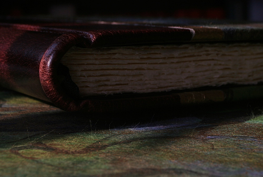
Not that those wonderful journals need sunlight to be pretty! They're made by book binding workshop Jenni Bick Bookbinding in Massachusetts, large and thick books in a format somewhere between A4 and A5 with a ribbed leather spine and a sweet tissue-paper-like cover in shades of blue, green and gold.

Jenni Bick Journal with cotton paper


One of them is filled with beautifully tattered-looking cotton paper, the other one with crisp chamois colored sheets with a hammered texture. In fact, they're so pretty they are intimidating. Can anyone's handwriting be beautiful enough not to besmirch one of these books? (Probably so! But, more importantly: can mine..?)

I'll take the plunge some day.

Jenni Bick journal.
The leather has an open surface and a slightly distressed look and feel to it which suits the "antique" style perfectly.

Jenni Bick Journal with cotton paper

Besides the stunning looks the journals are really well made. The bindings are strong and firm and everything feels like there's been a lot of thought and care put into it. It's a bit of a hassle to order stuff overseas but well... Europe has quite a few nice suppliers of stationery and notebooks but nothing like this - at least to my knowledge (if I'm wrong please let me know!).

"One of a kind" journals like these are made in small numbers only so they're not on their web site all the time, but you can usually snatch them up a few times a year (no, I'm not getting paid for this post! Though I wouldn't decline. Accepting journals too! *cough* :D)

Saturday, April 20, 2013

Bindewerk in detail

I took some more time recently to have a more detailed look at the Bindewerk journal I purchased last week.

Bindewerk Journal, size A5

I have to say it again, the outside is flawless. The cover is made of yellow printed cloth and thick coated paper. There also is an elastic closure in a matching orange tone. It's well bound and will ly flat when opened. Bindewerk products are handmade in Southern Germany but they have a highly professional look about them, everything looks and feels perfectly in place.

At the inside there's 288 pages of 90 gsm cream colored paper. They're offering plain and ruled sheets. The paper has a slight vergé texture but it's really very subtle - I'm not a fan of papers where this effect is so strong you feel the ups and downs with your pen.

Writing samples in the Bindewerk journal - front side

Ink tolerance, sadly, is so-so. This is a quick test run with three different pens, I've done some more samples afterwards and the outcome seems to depend strongly on the ink. The first and the third sample showed some feathering and the lines appeared much broader than they really are - which might become even more apparent when I say that the first and the third pen have B nibs which don't look narrower than the O3B in the middle.

The unexpected "winner" here is Private Reserve's "Electric DC Blue" as it behaves really well on this paper, the nib writes a relatively true line and it's also less prone to bleedthrough than the other inks.

Writing samples in the Bindewerk journal - back side

Especially Waterman's Florida Blue bleeds a lot on this paper, Iroshizuku ku-jaku not so much but there are still traces of it which probably will become more prominent when the ink is used in a wetter pen. Electric DC Blue alone comes clean. As the paper soaks up the ink pretty quickly many shading effects will be lost, so will be sheen effects - on the upside the ink dries really quickly. Well...

Conclusion: You can use a fountain pen in this journal, but not any pen nor any ink. Pity! Spring is finally here though and the weather's too good to be annoyed by a journal. Better to go out. Write, read, draw. Watch the cherry blossoms tumble to the ground in the warm air. Eat ice cream. Go shopping. Whatever!

Wednesday, April 17, 2013

Let's go to the papeterie

... because there's hardly any paper left!

Or is there?


In my last post I rambled about how great the internet is - and I'm definitely going to stick with my opinion here, however, no online shop can be as great as your small, crammed papeterie store where you can uncover all sorts of paper goodness. A few days ago I found one of these stores nearby. It was an enchanting experience (especially since I find most large stores rather disappointing in this respect). There were, of course, notebooks, greeting cards, photo albums of all kinds, there were notepads, gift wraps, pens - even a few fountain pens (by Lindauer). There were also paper lamps and all kinds of cute little gadgets. They even had a small selection of writing paper.

Here's what I brought home:

Bindewerk A5 journal
Beautiful yellow journal by Bindewerk from Bavaria, size A5 with lined pages. Flawless look and feel, haven't gotten around to testing the paper yet but it also feels good.

Letter writing set "Insects" by Le Typographe (A5)

Note pad (A5) and envelopes by Le Typographe, Belgium. White, exquisite feeling, watermarked paper with a little insect print on top of every page and each envelope. I'll definitely be on the lookout for other products by this brand, looks very interesting to me.

Also I found more writing paper sets, one with Vergé paper and a print of princes and princesses, the other plain ruled paper and envelopes with a map print on the inside.

It's awesome to browse offline stores for these kinds of things, touch book covers, dig for treasures on the lower shelves. Thank you, real life. ;-)

Are there any such stores in your area? Do you like to shop there?

Saturday, April 13, 2013

Bye bye, black turtle!

Letting one of my Nakayas go...


The internet! It has made my pen collection larger and more diverse than it would ever have been without. In fact, without the internet I may never have encountered the kinds of pens I'm really into and not started accumulating any at all. You see things, you want to have them (happens to me all the time anyway), it's a curse as well as a blessing. A few days ago, however, someone posted a pen for sale which I've wanted for quite a long time - and wanted to trade for something I, incidentally, had and would not miss too much!

I like my Nakayas, but they will be here for a long time (or so I hope). I'll always be able to get a new one and there are others to play with. But getting one of those grail pens by trade, that opportunity wouldn't occur all the time.

Enough text - here's the pen which is getting a new home soon. The pictures are not of the usual quality because I only had access to a phone camera, but it should give an impression.

Nakaya Portable Writer tame-sukashi "Black Turtle"

It's a Portable Writer with a tame-sukashi design which is called the "Black Turtle". I love tame-sukashi, the subtlety of it and how you still can perceive a shimmer when moving the pen in the hand. This was my first tame-sukashi pen (I have now two left) and has become my least favorite one, mainly because of the clip. It pains me to admit it but I haven't written with that one for at least a year.

Nakaya Portable Writer tame-sukashi "Black Turtle"

The Montblanc Agatha Christie I'll be getting in return (plus something extra which I'll put to good use as well) is my first and probably only pen of that kind. It was issued years before I had an intense interest in fountain pens so of course I missed it and prices have skyrocketed since then. So I've watched it from afar... until lately.

Thank you, Internet! Offline, finding an opportunity like that would've been much more unlikely.

Agatha is currently inked with Iroshizuku yu-yake, her broad nib being a smooth and luscious writer. No pictures just yet because I'm redecorating my photo space this weekend - and not willing to ruin the experience with phone pictures again - but soon. (I also haven't forgotten about the pictures of the Pelikan Sunlight!)

Have you ever traded pens or something else? What was it? Are you still happy with it?

Tuesday, February 19, 2013

Pelikan Sunlight on its way!

As I've been quite busy for the last week and didn't manage to take some more pictures for the blog, I just quickly want to share that my Pelikan M1000 Sunlight is on its way and I'll probably receive it within the week. Looking forward to that one a lot!

In the meantime there's another picture of the Pelikan Moonlight and the Namiki Yukari Nightline Moonlight to enjoy. Love sparkly, shimmery Raden.


Pelikan M1000 Moonlight and Namiki Yukari Moonlight Raden fountain pens.

Saturday, January 19, 2013

To think of spring

Christmas is over for a while now, and though the calendar tells us winter has only just begun I personally don't feel the need for any more snow and ice, both of which we've had rather a lot lately (comparably, of course. I don't mind if any Canadian or Scandinavian readers are laughing now. :D)

We're not really used to snow in this part of the country where winter usually means rain and, in short, a few more months of autumn, so when it snows it's usually something exciting (especially for children and car drivers) but when you've had it for a week you can't help but long for spring. It's like that for me anyway.
Leaving the house for work early in the morning, listening to the sound of snow under my feet while watching the slowly falling flakes in the orange light of the street lamps on my way to the train station: those are my favourite snow moments.

During the long wait for the spring I like to look at Namiki's Yukari "Yozakura" pen which depicts cherry blossoms as well as single flower petals in stunning purple, lilac, green and yellow hues of abalone shell. It's like watching the blossoms tumbling to the ground on a gust of wind.

Namiki Yukari Yozakura Raden.
This is just a glimpse as I'm still trying to create the right light for the Raden inlays to show their full beauty. Until I've succeeded this might give a small impression - and maybe makes you think of spring as well.

Do you also wish for the winter to end already or are is it your favourite time of the year? What sort of weather are you usually having in January?

Thursday, January 17, 2013

A large canvas: Danitrio Genkai in Seirei-Nuri Urushi

This is one of my two Genkai pens and one of the three largest ones I own, the other one being a Sailor Susutake. These are large pens, probably made with the thought of a generous canvas for maki-e artwork in mind (which is as amazing as it is out of reach).

Danitrio Genkai in Seirei-Nuri

Seirei-Nuri is a technique which is, as far as I know, supposed to mimick the pattern of a dragonfly's wings. I sometimes can't help thinking "giraffe" when looking at this pen, it definitely looks like something that could occur in nature.  Every pen is made by hand, the pattern being unique to each.

Danitrio Genkai in Seirei-Nuri

Under the golden web, the distinct color gradient of tame-nuri Urushi is just visible. The golden web is made first by a sort of dipping technique, then sprinkled with gold dust. The red lacquer is applied over it but polished so the gold will show again in the end.
Like many Urushi surfaces this one will look very different depending on the lighting, from dark crimson to nearly orange in bright sunlight.

Danitrio Genkai in Seirei-Nuri

When I handed the pen to my Mum she suspected it to be a pen case. She was in for a surprise!

Montblanc Meisterstück 149, Danitrio Genkai, Pelikan M1000.
I said it was big, right? But that doesn't mean much when you don't have anything to compare it to, so here's the Genkai next to a Montblanc Meisterstück 149 and a Pelikan M1000.

Danitrio Genkai in Seirei-Nuri

I love how the pattern flows around the edges.

Danitrio Genkai in Seirei-Nuri
A pen as large as this needs an extra large nib - and so it got one. This one's a beautiful factory broad stub, not exactly flexible but soft and yielding, a reliable and very wet writer. It fills with an eyedropper and has an additional shutoff valve to prevent it from leaking when not in use, which works remarkably well.

Thursday, January 3, 2013

A glimpse of Seirei-Nuri

... done on a Danitrio Genkai. Definitely one of my most eye-catching pens, for the size as well as for the striking pattern. More to come.

A Danitrio Genkai in seirei-nuri Urushi amidst Nakayas.
Happy 2013 everyone!

Tuesday, December 18, 2012

Fountain Pen Doodling

When I used to think about drawing, a lot of things came to mind with which to do it. Graphite, charcoal, pastels, maybe even a fineliner or a biro.

During the last weeks this view has shifted a bit. I still love pencils and especially my Derwent Inktense pencils and blocks (especially the blocks are awesome, the colours seem to explode once touched by water - if you like watercolour pencils you should definitely try those), but then I started to doodle with my fountain pens and I'm really enjoying this rather a lot.

For writing I love broad nibs, but I have a couple of fine ones too and they always come in handy on occasions like these - even better if they're flexible.

If wishes were fishes... we'd all cast nets.

The above was done with a Waterman Ideal and Diamine Majestic Blue ink (though that one's far from ideal because it doesn't flow well enough - and while drawing, a hard starting pen is even more annoying than while writing) on a Midori Traveler's Notebook sketchbook refill. I bought that refill before it crossed my mind I would really fill a lot of pages with drawings and I certainly won't buy one of those again for the paper is a major letdown in my opinion. It's supposed to take ink and watercolour well but there is a lot of bleed through with either of them and also feathering when using the smallest amount of flex.
(That iris is actually circular, by the way. It just looks odd on the picture. Someone needs to whip my shooting perspective into line.)

I want a strange doll for Christmas.

This one was done with a fine-nibbed Pelikan M800 and Montblanc Midnight Blue on cartridge paper, which also shows a little bleed-through on ink heavy spots like the pupil but is okay overall. Being not really my cup of tea for writing - too boring -, I like Midnight Blue quite a lot for sketches, it's a nice colour and doesn't smudge when dry. It's also a bit more water resistant than most inks though it still will wash out quite much when washed over with a wet paintbrush.

Do you know a truly waterproof fountain pen ink? This never really mattered to me before so I hardly know anything about them. The only ink that really took well to being painted over with watercolours was india ink, but that means a dip pen. Meh.


Friday, December 7, 2012

Pelikan M1000 Moonlight - The one that shines in the dark

Mystery Pen Unveiled


There are surfaces which love light, drink it, bathe in it while back in the shade they look subdued and dark. This also goes for pen's surfaces. Dark tame-nuri or tame-midori is an example, it can look almost black except when hit by a ray of sunlight (or a studio flash).

But then there's also those which start to shine when the light gets dim, like this Danitrio Mae West kawari-nuri which doesn't unfold its full charm in the sunlight.

Raden is another example, too much light and it looks dull. Put a Raden pen in a dimly lit spot and it will sparkle in the darkness like the neon lights of a nightly city.

Pelikan M1000 Moonlight and Namiki Yukari Nightline Moonlight

That the Mystery Pen was a Raden pen was easily discernible. Raden is a Japanese technique where pieces of abalone shell - beautiful colourful mother of pearl from Sea snails -, is attached to a surface with clear Urushi lacquer. It's often used in combination with maki-e and is a traditional Japanese art form. What makes the mystery pen all the more interesting is that it is a German pen, a Pelikan, to be accurate.

Pelikan M1000 Moonlight

The artwork, for which Pelikan employed a Japenese artist, Mr. Norio Matsuda, is done on the body of a Souverän M1000 as a limited edition from 2011. Raden work requires a lot of experience and patience. It's flawless. Mainly abalone pieces with a blue or green shimmer were picked to give an impression of cool moonlight, though their spectrum will also include a fair portion of purple depending on the viewing angle.

Pelikan M1000 Moonlight

Pelikan M1000 Moonlight

I posted this picture already but I'll have to show it again because it shows the abalone's lovely surface so clearly. Look at those ripples, like waves in a grotto or under a strange moon. The abalone stripes, though, are perfectly straight. It's all optics.

Pelikan M1000 Moonlight

The great thing about this pen is that it can always be your daily writer no matter what nib you feel like using. As with all Souveräns, you can always switch the nib yourself quickly and easily. This one is a BB nib, ground to cursive italic by John Sorowka.

I felt that it was time to do a review of this pen, not only because I like it so much but also because there's not a whole lot of info around about this pen since so few pieces were made and the owners seem to prefer to keep quiet about it.

To see such large pieces of Raden on a pen seems to be relatively rare. More frequently what seems like a large pieces is many minute Raden fragments put together mosaic style. When I get to it I'll show some more examples of how it can be used. It's a fascinating topic. I don't know if I will ever feel old enough to wear pearls, but mother of pearl on pens... or the pearl on the Montblanc Greta Garbo ... that's another story altogether.

Thursday, December 6, 2012

Nakayas nearly always lighten up my mood...

... which is why I need these pictures on a cold, grey and dark winter's morning like this one. The deep and vibrant colours, the wet-look glossy surface. Maybe you'll enjoy it as well, whatever the weather.

Danitrios, Nakayas and a Platinum Izumo.

Danitrios and Nakayas (and a savage dragon).

Saturday, December 1, 2012

Oh noes it's broken! Nakaya Negoro

Occasionally - in fact, sometimes I think it's more often than not - it's not perfection that turns a nice thing into a great thing but the carefully placed imperfections in it. I've heard that Arabian carpet weavers purposefully put some mistakes into their work because they believe no human is able - and allowed - to claim perfection.
(I think this isn't a bad approach at all, though I'm not sharing the religious background. Why not carefully put a few mistakes into your letter, your painting, your crafting project? That would take so much pressure away.)

Nakaya Negoro shiro-tame nuri
With this pen, Nakaya has gone a deliberate step farther and added not only imperfections but downright destructed elements to their work of art. Flawless planes of amber-coloured lacquer are broken here and there where the surface appears to have cracked, jagged outlines exposing the dull ebonite underneath. 
This doesn't only look cool - to me anyway - but also feels interesting to the touch. It becomes apparent how thick the lacquer layer - or in fact, the many layers - on the ebonite corpus actually is, that it really is thinner at the gripping section, that most of the lacquer seems to be very light with only a slight touch of a dark varnish over it.

Nakaya Negoro shiro-tame nuri

This model is the mid-sized Portable Writer. The Negoro design is often done on a Piccolo, which I was a bit ambivalent about because, though I do like the Piccolo, I sometimes catch myself thinking "Hey, a bunch of money and all I'm going to get is such a small pen?". (Yes, that's irrational, absolutely! But well, at the moment that I decided to take the plunge on a Negoro and found out that nibs.com had one on a Portable size, I didn't take too long to make up my mind.)

Nakaya Negoro shiro-tame nuri
Love these cracks. They seem to enhance the glossy surface rather than destroy it. 

Nakaya Negoro shiro-tame nuri
The only thing I am a little ambivalent about on this pen - and this may come as a surprise - is the clip. I'm having a love/hate-relationship to clips, because despite I hardly ever clip the pens to anything and especially the Nakaya clips are not really beautiful to my eye, I appreciate their stopping the pen from rolling around. Yes, Nakaya do roll stoppers, but they're definitely not my cup of tea.

On the Negoro, I decided to go for the clip. That skilfully placed crack near the clip band.


 Nakaya Negoro shiro-tame nuri and Montblanc 149 
I also decided I'm going to do more size comparisons in the future because I always find them extremely helpful myself when reading about pens I don't know about. Here's next to a Montblanc 149, the Montblanc is a little fatter - though this Portable is actually quite a lot fatter than my other Nakayas, their sizes always varying a bit because they are hand turned - but else there's not much difference here. The Nakaya is a little lighter than the Montblanc when capped but a little heavier when uncapped. The cap doesn't post.

 The nib is a plain gold 0.9 mm stub done by John Mottishaw. Like all my pens I've got from him so far it works flawlessly, juicy and smooth, and this width is my favourite. I already have a cursive italic from him in the same size, I'll compare them some time.

Like all Nakayas, it's a c/c filler. Currently inked with Sailor Jentle Rikyu Cha (I have to write more about this ink sometime. This ink...! When I tried it first I thought "uh, mud". But it's so much more than that. There's green in it, olive, brown shading... I'll show you.)