Showing posts with label Handwriting. Show all posts

Wednesday, November 6, 2013

Pelikan M1005 or: Time for Orange - yet again!


On most days I'm not perfectly sure what my favorite color is. On other days I just know it's orange.

It's also the perfect color for autumn to lighten up those gray and stormy days - so after I've shown you Iroshizuku yu yake and and Montblanc "Ink of Joy" last year here's yet another orange ink, the (sadly discontinued) Caran d'Ache Saffron.

Pelikan M1005 Demonstrator with Caran d'Ache Saffron
 I've had that M1005 Demonstrator for a while but haven't used it too much, mainly because it comes with a rather limited range (F, M, B) of full rhodium plated nibs. I ordered it with an F but then it seems I'm not really an F nib kind of girl.


So I decided to "frankenpen" it with one of my regular M1000 nibs so I could get to use my gorgeous reground and crisped up BB, 3B or O3B. This is the awesome 3B: great line variation, wet, responsive and "soft" as is common for the M1000 size nibs. Nib work has been done by John Sorowka.


It's hard for me to overlook such mismatches usually but it's not so bad this time. There's a lot of rhodium plating on that nib anyway and it matches alright with the orange ink adding warm color to the insides of barrel and section.

I  have two demonstrator pens, this one and a TWSBI (not counting the semi transparent and somehow quite demonstrator-like Omas Extra Lucens), but somehow I've never gotten around to putting orange ink into any of them until now. Most orange inks truly are amazing for transparent pens. Saffron almost looks blood red. I haven't heard of it staining anything either.

Pelikan M1005 Demonstrator with Caran d'Ache Saffron


Quote by Frank Herbert from the "Dune" series.

I haven't tried an orange ink which I didn't like - except maybe for Stipula Zafferano which also looks very nice but is just too light to be easily readable.

Caran d'Ache Saffron is great in every respect: easily readable, offers great shading and flow properties. The color is a bright orange lacking the "burnt" aspect of yu yake or Noodler's Apache Sunset but is not as highlighter-ish as Montblanc's "Ink of Joy". If you love orange and have the chance to snatch up a bottle: do it before they're gone for good!

Do you like to use orange ink? What's your favorite?

Friday, September 13, 2013

Ink fun: Turquoise

Autumn is here, chilly, rainy and dreary - the time of year where I like to turn to ink in the colors of warm brown, orange, red or green. However, some cheerful turquoise never goes amiss!

Here's a small scale comparison of the three turquoise inks in my possession: Waterman South Sea Blue, Visconti aquamarine and Diamine turqoise.

I played around a bit with Pilot Parallel pens, can't say I'm really a fan yet, I guess I'll have to practice some more... Especially the broader ones are quite demanding when it comes to writing angles and such - not at all like my forgiving stubs and cursive italics!


If not viewed exactly next to each other the inks look very much alike, but there are subtle differences. South Sea Blue is the darkest ink with the most prominent sheen, whereas Vixconti blue is quite light, greener than the other ones and has nearly no sheen at all.


They're all reasonably well behaved - though I've got the feeling that all turquoise inks can a little reluctant flow wise which can lead to trouble when used in pens with the same predisposition. 

I'm planning to do some more comparisons like this one and show you my inks.

Pens: Pilot Parallel Pens 2.4, 3.8 and 6.0 mm
Paper: Le Typographe Belgian Notebook, dot grid (review about Le Typographe)

Pictures also starring a Danitrio Genkai in kuro-tame nuri Urushi.

Do you like and use turquoise inks? Which one is your favorite?

Saturday, April 20, 2013

Bindewerk in detail

I took some more time recently to have a more detailed look at the Bindewerk journal I purchased last week.

Bindewerk Journal, size A5

I have to say it again, the outside is flawless. The cover is made of yellow printed cloth and thick coated paper. There also is an elastic closure in a matching orange tone. It's well bound and will ly flat when opened. Bindewerk products are handmade in Southern Germany but they have a highly professional look about them, everything looks and feels perfectly in place.

At the inside there's 288 pages of 90 gsm cream colored paper. They're offering plain and ruled sheets. The paper has a slight vergé texture but it's really very subtle - I'm not a fan of papers where this effect is so strong you feel the ups and downs with your pen.

Writing samples in the Bindewerk journal - front side

Ink tolerance, sadly, is so-so. This is a quick test run with three different pens, I've done some more samples afterwards and the outcome seems to depend strongly on the ink. The first and the third sample showed some feathering and the lines appeared much broader than they really are - which might become even more apparent when I say that the first and the third pen have B nibs which don't look narrower than the O3B in the middle.

The unexpected "winner" here is Private Reserve's "Electric DC Blue" as it behaves really well on this paper, the nib writes a relatively true line and it's also less prone to bleedthrough than the other inks.

Writing samples in the Bindewerk journal - back side

Especially Waterman's Florida Blue bleeds a lot on this paper, Iroshizuku ku-jaku not so much but there are still traces of it which probably will become more prominent when the ink is used in a wetter pen. Electric DC Blue alone comes clean. As the paper soaks up the ink pretty quickly many shading effects will be lost, so will be sheen effects - on the upside the ink dries really quickly. Well...

Conclusion: You can use a fountain pen in this journal, but not any pen nor any ink. Pity! Spring is finally here though and the weather's too good to be annoyed by a journal. Better to go out. Write, read, draw. Watch the cherry blossoms tumble to the ground in the warm air. Eat ice cream. Go shopping. Whatever!

Saturday, November 10, 2012

Amalfi Paper

The review I just couldn't put up any longer.

(also starring a Pen of the Year 2008)

As announced in my post about my leather journals I need to show you one of my favourite papers: cotton paper from one of the oldest papermills in Europe, located in Amalfi, Italy, right at the shores of the Mediterranean Sea.

Amalfi paper: A notebook, cards, writing paper.

The picture above shows three different kinds of Amalfi paper I have hoarded: the A4-sized 80-90 g/sqm writing paper, a few somewhat heavier folded cards and a little notebook, again with somewhat heavier paper.

One of the most prominent features about this paper is, while all of the edges are deckled, one of them is very rough and looks a bit like cloth or a tissue paper that has been torn apart. It's incredibly soft to the touch.

Cards made of Amalfi paper with a Pen of the Year 2008 on top. Look at the paper's lovely edges.
Yes, I know, this picture reminds of the ad for the Pen of the Year 2008 - but the pen just looks awesome on this delicious paper.

How the paper reacts to fountain pen ink can vary. Whereas the writing paper is very well coated and resistant to bleed through and feathering even with the wettest nibs, some of the card stock can be prone to feathering. For online shopping I can recommend La Scuderia del Duca in Amalfi, they are quick and all the paper and cards I got from there were perfectly well behaved. Especially the ink jet paper is a good deal if you want to make your own notebooks.

The paper is 100% cotton and like all cotton papers I've tried up to date it will soak up a bit more ink than smooth papers, thus making your lines appear thinner. The textured surface might also make your hairlines look a bit shaky, as you can see in the picture below.

Writing Sample on Amalfi paper, done with a semi-flex Swan 3161 and Montblanc Ink of Joy

This surely is the diva kind of paper, but I just love the look of ink on cotton paper - if the pens decide to write on it. Not all of them do, they will start with a nice lush ink flow but within a few lines the flow will cease and there will be skipping. From my personal experience Pelikan and Nakaya nibs will handle the paper very well, Montblanc nibs will provide varying results and Danitrios nearly always fail on it. So if you want to write a nice long letter on Amalfi paper with your favorite pen it's a good idea to try first if the pen will do the job on this paper.
Each sheet is watermarked, even the cards, though the watermarks can vary. This is the watermark on my writing paper. As you can see the paper is taking the ink well even on the watermark.

Amalfi paper watermark.

It's also great for watercolour or water-ink-painting. Not sure if it's the cotton or the surface texture, in any case the colours will appear more vibrant than on other papers I've tried.

Poems by Hilde Domin ("Einhorn") and Rainer Maria Rilke ("Herbsttag").

Wednesday, November 7, 2012

Time for Orange - again! Montblanc Ink of Joy

(also starring a Mabie Todd Swan 3161)

My passion for orange ink doesn't end with Iroshizuku yu-yake! There are so many great orange inks out there and I only know a fraction of them. One of those is Montblanc's "Ink of Joy", one of last year's limited edition inks. It was part of a trio of inks, the other two being "ink of friendship" - I believe it was blue - and "ink of love" (red, of course).

Montblanc "Ink of Joy" in a Mabie Todd Swan with semi-flex nib.

Compared to yu-yake, this is more of a pure, textmarker-y orange. It lacks the burnt aspect of yu-yake and also doesn't shade as much, but the colour is very nice and full of sunlight - which can't go wrong now that the days grow shorter and darker.

Like yu-yake this ink needs some flow and/or a broad tip to show its full beauty and remain legible, the "ink of joy" even more so because the flow seems to be a little hesitant. It's also a really nice match with the semi-flex nib, at least in my opinion - if it weren't for the penmanship, which of course could be better. I feel I still haven't had the famous light bulb moment when it comes to using a flex nib, it's still a bit of a struggle.

Montblanc "Ink of Joy" in a Mabie Todd Swan with semi-flex nib.

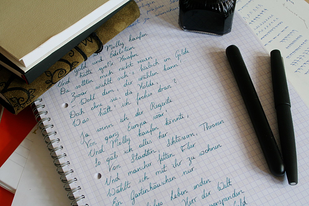
The text is from a beautiful and sad poem by Erich Fried, called "Das Schwere" ("heaviness", literally translated) which is all about endings, losses and autumn as the time "between harvest and death". It sounds more depressing than it is, really, but I guess it could use some orange ink to lighten it up and keep in mind that, one more time, spring will come again.

Montblanc Ink of Joy (top) and Iroshizuku yu-yake (bottom)

Here's a quick comparison between "Ink of Joy" and "yu-yake". It's not awfully valid since nib width and flow properties of the used pens are so different but you can see the "burnt" aspect and more red pigments in "yu-yake" whereas the "Ink of Joy" is brighter and more vibrant.

For paper I've used a Rhodia dot pad which is one of the nicest paper for writing with a fountain pen because it is very smooth and tolerates almost any degree of ink flow without feathering or bleed-through. The only paper I've tried that's even better in this respect is Amalfi paper - a review is coming soon.
Rhodia is a french company who buy their paper from Clairefontaine and their properties are pretty similar, however Clairefontaine doesn't do the dot grid yet. I adore the dots, they are unobtrusive but still offer some guidance. After I've revamped my handwriting I've been unable to write in straight lines on blank paper for a long time and it's still not perfect, though much better now, so the dot grid grew on me.

For the sake of completeness I'd like to add that not every fountain pen user is a fan of Rhodia/Clairfontaine paper because some pens won't write well on it. This is mostly due to its smoothness: ink will only flow from the nib onto the paper if capillary action is permitted. If the nib tip isn't shaped 100% right and the paper - like CF/Rhodia - doesn't provide a lot of upright micro fibers to meet the nib half way skipping and hard starting can be the consequence. If your pen is one of those candidates, a little tweaking by an experienced nibmeister can probably help. (My limited experience: If a nib is really well ground and set it will write on nearly anything, but it wouldn't be realistic to expect this of any pen. There are divas among them, as are among us. :-D)

Sunday, October 28, 2012

Time for Orange! Iroshizuku yu-yake

Fall is here and winter isn't far either. Today has been the first cold day and we've had the first snowfall in parts of the country. The leaves that have been sporting warm yellows and reds for weeks have now gone limp and will fall in a matter of days. It's high time for warm colours!

Also in inks I find that I prefer cool blues and teals in summer, but keep going back to oranges, reds and brown in winter. At the moment an especially beautiful orange/burnt yellow ink is sloshing around in the tank of my gorgeous Montblanc 149 with super broad oblique nib: Iroshizuku yu-yake.

Iroshizuku yu-yake in Montblanc Meisterstück 149

Definitely one of those inks which are made for wet, wet, wet nibs. It might also work with a narrower tip if the pen is wet enough, else legibility might suffer.

I'm not going to go into the details of ink reviewing a lot since I a) don't have access to a scanner and b) am not 100% sure my monitor is calibrated enough to show the finest nuances of inks plus c) and most importantly I don't have the scientific interest to analyze my inks in terms of flow, feathering and what not.

So in all shortness and very subjectively: That is a really nice ink! Look at the shading. It looks best on ivory or cream coloured paper like the one in the picture. It's 100% cotton Büttenpapier (watermarked paper) by German papermill DFW in Dresden. Like all cotton papers it absorbs quite a bit of ink so you will need a wet pen or the lines will look skinny.

Iroshizuku yu-yake in Montblanc Meisterstück 149

The colour reminds me of something I can't quite put my finger on, maybe something I used to see when I was a child, but definitely something associated with fall. Pumpkins? Crisp, brown leaves on a sunlit path? No, that's not it though close. In any case it's a good memory. Maybe it will come back one day.

The ink also works perfectly with the 149, which currently is my go-to pen for writing letters and journal. It's surprising how easily your handwriting will fit into common boundaries even with such a broad nib as long as there's some line variation involved to keep your letters open (except for the Es, but that's not due to the nib. I manage to get closed-up Es with extra fine nibs - another aspect my handwriting still needs improvement in.)
I also love the ink window, not only for being convenient but also because it reminds me of film rolls.

The text, by the way, is a "Lord of the Rings" quote. I love so many passages of those books, they give me the goosebumps. It's the part where Gimli is scolded by Celeborn for stirring up the evil in Moria and crossing their border and is then consoled by Galadriel. One of my favourites.

Another one is where Gimli tells Legolas about the wonder of the caves at Helm's Deep. (Yes, I like Gimli!)

Tuesday, October 9, 2012

About (my) handwriting

A long way

(also starring: a Lamy 2000, a Lamy Dialog3, some Platinum cartridges and a bottle of Diamine Sapphire Blue. :D)

Rin (kisses) asked me if I could do a post about my handwriting and how it developed over time. Maybe she could do it better than me because of all the letters from me she received during the process, but I'll try to give an impression. Since I tend to keep old notes and stuff until I make a conscious effort to throw them away it shouldn't be too hard. Click on the pictures to enlarge them.


Some time 2009, written with a fine nib.

This is where I started out about 2 years ago. The handwriting is fairly regular, legible (I think) but tiny. It's not that I disliked my handwriting, but I wanted something right-slanted and more versatile so I could use different nib sizes and wasn't limited to EFs. Besides I was getting annoyed by all those letters not being connected to each other; my new script should be cursive.

In fact, using different nibs is one of the greatest things I've discovered since then.

Early 2010, written with one of my first good fountain pens, a ST Dupont Olympio (not in the picture). Ink must be J. Herbin Vert Olive. I was quite into that one at that time.

If you start going somewhere, it's always good to know where you're headed. I didn't, so I wasn't getting anywhere for quite a while. All I knew was that I wanted a right slant and something graceful, copperplate-ish. Also I was a pure finger writer and I wanted to involve my arm and shoulder muscles more (something I still haven't quite achieved). I read a good way to practice this was to make larger letters. On this picture the slant is pretty much 90 degrees and the letters are already a bit more connected than in the first picture.

Later in 2010. The letters are getting more regular, so is the (still very subtle) right slant. Written with my first italic nib, the Pelikan IB (not in the picture).
The progress stagnated for some months. I just couldn't get a decent right slant to the letters - and this is indeed hard if you had a backward slanted handwriting for most of your life. Then I discovered slant guidelines: diagonal lines running over the paper in just the slant you want your handwriting to have. This helps to adjust and I put one behind every sheet of paper I wrote one until I got used to it. That took another few months.

A guidesheet with horizontal and slant lines. I did exercises like the pictured one a lot. Eternal rows of Ms, Ns, Us, LUs and whatnot. Notable improvement came very soon.
Exercises like the one pictured above were invaluable for me. Without these and the slant lines it probably wouldn't have worked out.

Early 2011. Still looks a little weird, like it's not really worn in - which it wasn't. But by that time I started seeing results slowly. Slant is on the way to how it's supposed to be.
During those years I also tried a lot of new pens, papers and inks. In matters of efficiency this probably didn't help, but it was tons of fun. If you want to make quick progress on your handwriting though, I'd recommend getting used to one pen you like and sticking to that one along the way.

http://www.iampeth.com/ is a great resource for different (historic) handwriting styles. Whole books with exercises and instructions can be found here. It's also great for browsing to find out where you want to go.

Early 2012. Regularity is no longer much of an issue, the slant guides are out of business. Still many irregularities in the shaping and sizing of letters, but no longer that obvious. I like to write with broader nibs because they are more forgiving in that respect than fine ones.

Today.

Last picture, transcribed:
9th October, 2012. Still far from where I feel I'd like to be - but getting there, and having as much fun as possible on the way. I'm also still at the very beginning of the journey into the realm of flexible nibs - but, as Michael Ende used to say, that's another story to be told another time.